Laser-cut signage delivers clean edges, intricate details, and a premium finish. However, even the most advanced CO₂ laser-cutting equipment cannot compensate for a poor design. According to NCTools, the complexity of a laser-cut design determines its costs. So, if errors occur on an intricate design, the cost of rework doubles.
The majority of quality issues occur at the design phase of a project, long before the fabrication starts. Thin design elements, poor spacing, and incorrect file preparation often lead to laser-cutting reworks. By understanding these mistakes and knowing how to avoid them, it helps you create stunning laser-cut signs for your business in Perth.
Why Your Laser-Cut Signages Came Out Bad
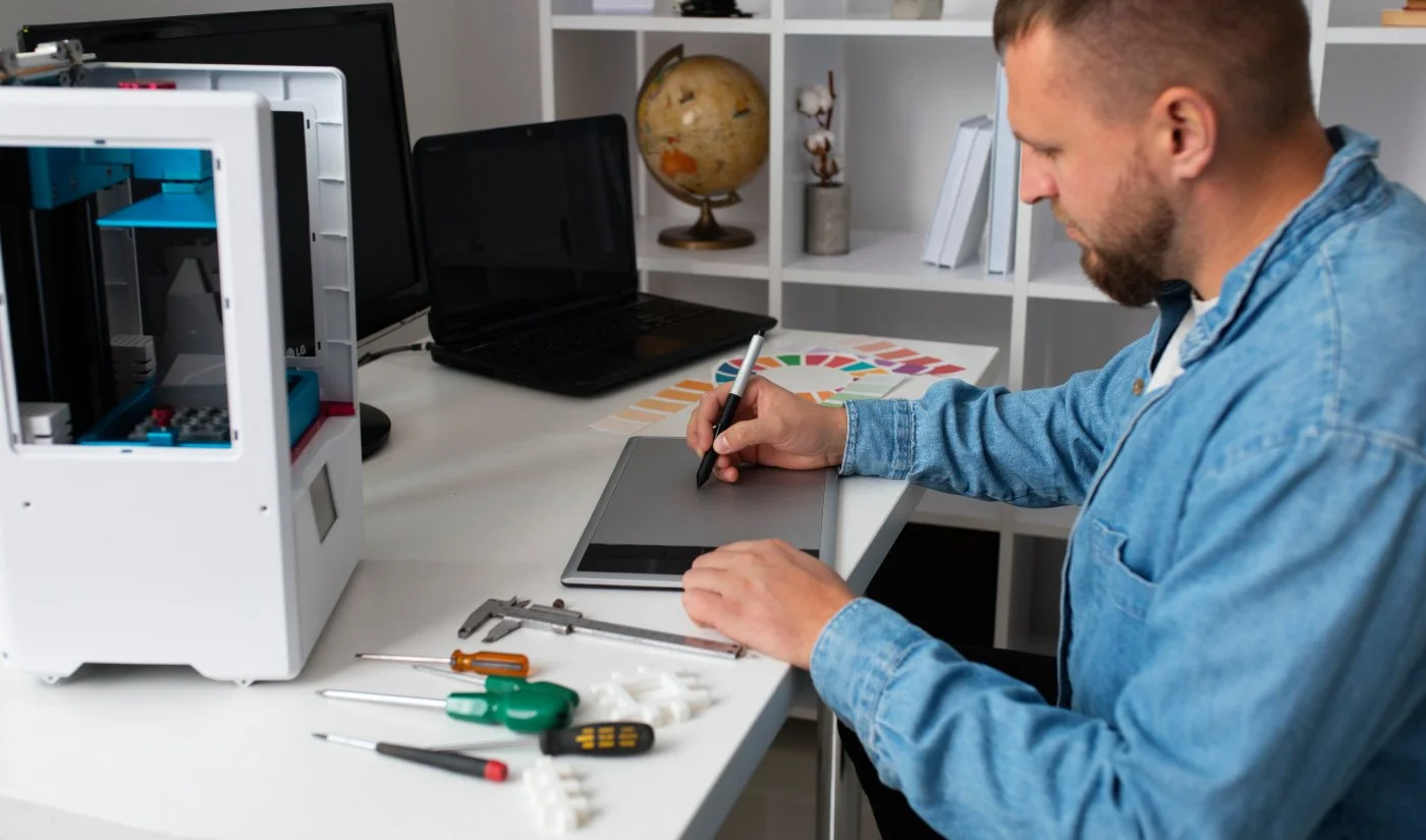
Laser cutting machines follow digital files with remarkable precision to reproduce the design content. Every line, curve, and cut path directly influences the output and finish of the sign. For this reason, an expert signage company in Perth reviews the design before production to avoid any costly mistakes.
A thorough design assessment helps you identify potential weaknesses before any material is cut, resulting in smoother signage production. Neglecting to do so will make you end up spending more money for just one design alone.
Here are three design mistakes that reduce the quality of laser-cut signs in Perth:
Mistake #1: Using Strokes and Details That Are Too Thin
The first design issue occurs when artwork includes strokes, bridges, or decorative details that are simply too fine for the selected material. Although impressive on screen, the laser-cut process would make the signs fragile, especially for thin materials made of acrylic, timber, or metal. This increases the likelihood of breakage during fabrication, transport, and installation.
Thin lettering can also become difficult to read from normal viewing distances, reducing the sign’s effectiveness. One approach to this problem is to simplify the design and allow for Kerf compensation. It allows the cut to match the dimensions without compromising the structure. As a result, you get a visually balanced stainless steel sign through laser etching.
Mistake #2: Poor Spacing for Letters and Elements
Another common design mistake involves placing the design elements too close to each other. Tight spacing limits material stability during cutting and may reduce the overall clarity of the finished design.
To allow adequate spacing for better readability, you can start by choosing the right font for signage. The most recommended fonts for laser-cut signs in Perth include:
Montserrat
Gotham
Avenir Next Demi
Helvetica Neue
Futura
Aside from typography, a professional signage company in Perth also considers the signage size dimensions and viewing distance.
Mistake #3: Providing Incorrect Design Files
Even an excellent design can encounter problems if the supplied artwork is incomplete. Common issues include low-resolution images, file format types, missing fonts, duplicate cut lines, open paths, and incorrect scaling. These errors frequently result in production delays and turnaround times while files are corrected.
To prevent this, always provide clean vectors in AI, EPS, SVG, or PDF file extensions. Other solutions also involve doing the following measures:
Converting text to outlines
Removing duplicate paths
Confirming artwork dimensions
Doing these practices improves the quality of signage for your business. In addition, it elevates your overall brand perception and directly drives customer foot traffic.
Get Custom Laser-Cut Signages at Artcom Fabrication
Functional signage is made with thoughtful design that's prepared for precise manufacturing. By avoiding the three common mistakes mentioned above, you can achieve visually impactful signage that stands the test of time.
At Artcom Fabrication, we combine expert design knowledge with precision laser cutting to produce custom signage built for lasting performance. To plan laser-cut signs for your business in Perth, contact us today!
Frequently Asked Questions (FAQs)
Here are answers to commonly asked questions about laser cutting for your signage:
How to design for laser cutting?
To make a design for laser-cutting, use a vector-based artwork with adequate line thickness, spacing, and correctly scaled dimensions. Keep the design simple enough to ensure clean cuts.
What file format produces the best laser-cut results?
Vector formats such as AI, EPS, SVG, and PDFs produce the most accurate results that preserve precise cut paths and reduce file corrections.
Can an existing design be modified for laser cutting?
Yes, most existing designs can be adjusted to suit laser cutting requirements. A fabrication specialist can optimise the artwork by refining thin details, spacing, and cut paths.